Mosaic Chicago
One brand for a hundred unbuilt homes
One brand for a hundred
unbuilt homes
Core Build Inc. • Chicago, Illinois • 2025
Core Build Inc. • Chicago, Illinois • 2025
Brand Identity
3D Rendering
Walkthrough Animation
VR Tours
Marketing Ready Floor Plans
Interactive location map

Core Build came to us with a hundred sites scattered across Chicago. Not a development. A hundred separate parcels, on the West Side and the South Side, in neighbourhoods where people already live and work and raise children.
The homes would be built for those neighbourhoods. Not investment product for someone else's portfolio, but houses meant for the city's own residents, on the streets they already know.
None of it existed yet. And a hundred empty lots on a map is not a vision. It's a spreadsheet.
Core Build came to us with a hundred sites scattered across Chicago. Not a development. A hundred separate parcels, on the West Side and the South Side, in neighbourhoods where people already live and work and raise children.
The homes would be built for those neighbourhoods. Not investment product for someone else's portfolio, but houses meant for the city's own residents, on the streets they already know.
None of it existed yet. And a hundred empty lots on a map is not a vision. It's a spreadsheet.
The problem with a hundred of anything
The problem with a hundred of anything
A single development sells itself as a place. You photograph the building, you name the street, you describe the life inside it. But Mosaic wasn't a place. It was a hundred places, none of them adjacent, none of them built, spread across a city large enough that two sites might have nothing in common but an owner.
A buyer looking at one lot on Karlov Avenue has no reason to care that there are ninety-nine others. An investor looking at all hundred has no reason to believe they add up to anything.
So the work had a strange shape. Before we could make a single home feel real, we had to make a hundred addresses feel like one thing.
A single development sells itself as a place. You photograph the building, you name the street, you describe the life inside it. But Mosaic wasn't a place. It was a hundred places, none of them adjacent, none of them built, spread across a city large enough that two sites might have nothing in common but an owner.
A buyer looking at one lot on Karlov Avenue has no reason to care that there are ninety-nine others. An investor looking at all hundred has no reason to believe they add up to anything.
So the work had a strange shape. Before we could make a single home feel real, we had to make a hundred addresses feel like one thing.
The obvious answers were all wrong
The obvious answers were all wrong
The obvious moves were right there. A Chicago street grid, clean and civic, and cold as a utility diagram for something meant to feel like home. The city's six-pointed star, the most local of the options and the most borrowed, saying Chicago louder than it said Mosaic. Dimensional letterforms with real architectural weight, when weight was never the problem.
The obvious moves were right there. A Chicago street grid, clean and civic, and cold as a utility diagram for something meant to feel like home. The city's six-pointed star, the most local of the options and the most borrowed, saying Chicago louder than it said Mosaic. Dimensional letterforms with real architectural weight, when weight was never the problem.

The answer wasn't in the city. It was in the name.
A mosaic is not one thing pretending to be whole. It's many separate pieces that become whole only when you step back far enough to see them together, which is exactly what a hundred lots across a city are.
So we built the mark from tiles. Rounded squares arranged to form MC, each with its own weight of colour, resolving into letters only when you take them in at once. Up close, pieces. From a distance, a name.
The answer wasn't in the city. It was in the name.
A mosaic is not one thing pretending to be whole. It's many separate pieces that become whole only when you step back far enough to see them together, which is exactly what a hundred lots across a city are.
So we built the mark from tiles. Rounded squares arranged to form MC, each with its own weight of colour, resolving into letters only when you take them in at once. Up close, pieces. From a distance, a name.
Which is the same thing the initiative does. A hundred parcels, each its own address on its own block, each meaning very little alone. Seen together, they become Mosaic Chicago. The logo isn't a picture of the idea. It's the idea, built the same way, at a size you can hold in your hand.
The corners were the decision. Square tiles would have read as a grid, corporate, a data point, the same coldness the street-grid route died of. Rounded, they turn ceramic: handmade, domestic, closer to a kitchen backsplash than a logo.
Which is the same thing the initiative does. A hundred parcels, each its own address on its own block, each meaning very little alone. Seen together, they become Mosaic Chicago. The logo isn't a picture of the idea. It's the idea, built the same way, at a size you can hold in your hand.
The corners were the decision. Square tiles would have read as a grid, corporate, a data point, the same coldness the street-grid route died of. Rounded, they turn ceramic: handmade, domestic, closer to a kitchen backsplash than a logo.
Color that doesn't talk down
Real estate branding has a default palette, and it is always the same: black, gold, deep navy, the visual grammar of exclusivity. It signals that something is expensive, which is another way of signaling who it is not for.
That was the wrong language entirely. So we built the palette from greens and teals, warm rather than cool, with a soft coral accent Core Build chose from what we proposed. The tonal range does structural work too, the shifting values across the tiles are what let the eye separate the letters, so the palette and the mark solve each other.
The result reads as approachable without reading as cheap, which is a harder line to walk than luxury. Anyone can make something look expensive. Making something look like it was made with care, for people who are usually sold to carelessly, takes more thought.
Real estate branding has a default palette, and it is always the same: black, gold, deep navy, the visual grammar of exclusivity. It signals that something is expensive, which is another way of signaling who it is not for.
That was the wrong language entirely. So we built the palette from greens and teals, warm rather than cool, with a soft coral accent Core Build chose from what we proposed. The tonal range does structural work too, the shifting values across the tiles are what let the eye separate the letters, so the palette and the mark solve each other.
The result reads as approachable without reading as cheap, which is a harder line to walk than luxury. Anyone can make something look expensive. Making something look like it was made with care, for people who are usually sold to carelessly, takes more thought.

Two kinds of home
Mosaic wasn't one house type repeated a hundred times. It was single-family homes and multi-family buildings, different footprints for different sites and different lives, and both had to be visualized to the same standard.
We modeled both typologies from Core Build's plans, then built custom furniture and fixtures rather than pulling from a library, because generic furnishing is how renders start to look like everywhere and nowhere. The exteriors sit in their streets: the single-family home in wood and panel with its roof deck, the multi-family in Chicago red brick with tall glass. They look like they belong on the blocks they were drawn for.
Mosaic wasn't one house type repeated a hundred times. It was single-family homes and multi-family buildings, different footprints for different sites and different lives, and both had to be visualized to the same standard.
We modeled both typologies from Core Build's plans, then built custom furniture and fixtures rather than pulling from a library, because generic furnishing is how renders start to look like everywhere and nowhere. The exteriors sit in their streets: the single-family home in wood and panel with its roof deck, the multi-family in Chicago red brick with tall glass. They look like they belong on the blocks they were drawn for.

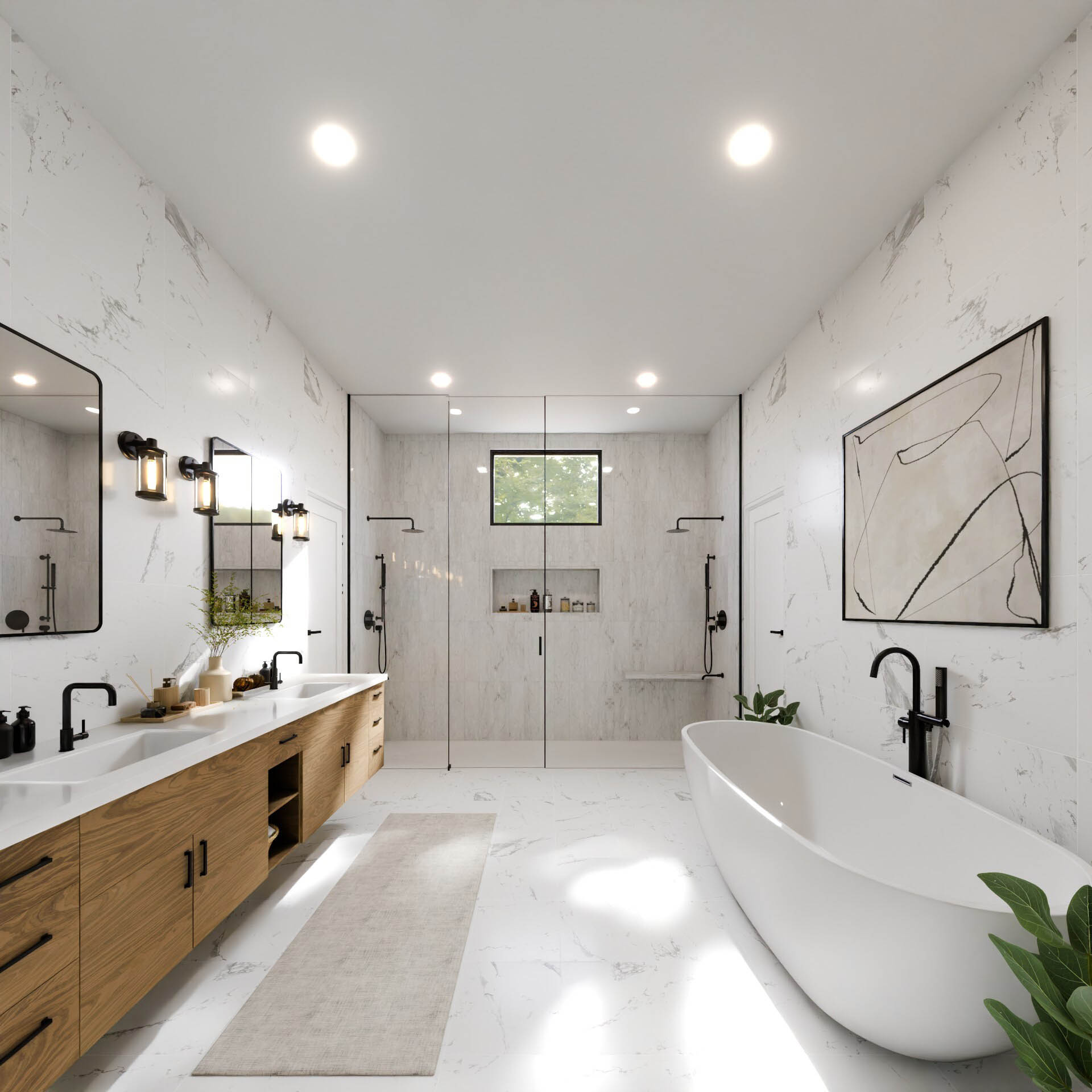
The interiors had the most to prove. A buyer who has been shown a lot of thin marketing in their life can tell instantly when a render is being polite to them. So these were built as homes people would want: a real kitchen with a working island, a room that could be an office or a bedroom depending on the life inside it, light that falls the way light falls.
The interiors had the most to prove. A buyer who has been shown a lot of thin marketing in their life can tell instantly when a render is being polite to them. So these were built as homes people would want: a real kitchen with a working island, a room that could be an office or a bedroom depending on the life inside it, light that falls the way light falls.




Rooms to stand in
A hundred sites means a hundred conversations that start the same way: someone asks what the house is actually like.
We built 360 tours for both typologies so the answer could be shown instead of described. A buyer moves through the house at their own pace, stops where they want to stop, and works out for themselves whether the kitchen is big enough or the third bedroom is really a bedroom. Those are the questions people ask when they're serious, and they're hard to answer with a photograph and a floor plan.
A hundred sites means a hundred conversations that start the same way: someone asks what the house is actually like.
We built 360 tours for both typologies so the answer could be shown instead of described. A buyer moves through the house at their own pace, stops where they want to stop, and works out for themselves whether the kitchen is big enough or the third bedroom is really a bedroom. Those are the questions people ask when they're serious, and they're hard to answer with a photograph and a floor plan.
Two ways to move through a house
A tour answers a buyer's questions. Film answers a different one, which is whether they want to live there at all.
So we made two.
The first is a lifestyle film: the house as it would be lived in, light moving through rooms across a day, the pace slow enough that you stop reading it as marketing and start imagining yourself in it. It works before anyone has asked about square footage, because nobody weighs a floor plan until they already want the life inside it.
A tour answers a buyer's questions. Film answers a different one, which is whether they want to live there at all.
So we made two.
The first is a lifestyle film: the house as it would be lived in, light moving through rooms across a day, the pace slow enough that you stop reading it as marketing and start imagining yourself in it. It works before anyone has asked about square footage, because nobody weighs a floor plan until they already want the life inside it.
The second is plainer and does the opposite job. It walks the house room by room, and each shot opens on the raw geometry before resolving into the finished space, the model becoming the room. It shows the house honestly, in sequence, with nothing hidden between cuts, and it shows how the thing was made.
The second is plainer and does the opposite job. It walks the house room by room, and each shot opens on the raw geometry before resolving into the finished space, the model becoming the room. It shows the house honestly, in sequence, with nothing hidden between cuts, and it shows how the thing was made.
Plans anyone could read
Floor plans are usually drawn for builders and handed to buyers, as though both want the same thing from a drawing. We redrew them: clean, warm, branded, legible at a glance, so that someone with no training could see how a family would actually move through the house.
Floor plans are usually drawn for builders and handed to buyers, as though both want the same thing from a drawing. We redrew them: clean, warm, branded, legible at a glance, so that someone with no training could see how a family would actually move through the house.

A hundred sites, one map
The last piece was the one that made the whole portfolio graspable.
A hundred sites is an abstraction until you can see them. So we built a web-hosted interactive map: every site pinned across Chicago, browsable, filterable, the spread of the thing finally visible in one view. An investor could take in the scale of the initiative in a single screen. A buyer could find the neighborhood they already wanted to live in.
There was a constraint. The exact addresses couldn't be published wholesale ahead of the launch, but the geographic spread was the entire argument. So the map was built to give the truth of the distribution, where the sites clustered, how far they reached, what parts of the city they served, without handing over the full list before Core Build was ready to release it.
The last piece was the one that made the whole portfolio graspable.
A hundred sites is an abstraction until you can see them. So we built a web-hosted interactive map: every site pinned across Chicago, browsable, filterable, the spread of the thing finally visible in one view. An investor could take in the scale of the initiative in a single screen. A buyer could find the neighborhood they already wanted to live in.
There was a constraint. The exact addresses couldn't be published wholesale ahead of the launch, but the geographic spread was the entire argument. So the map was built to give the truth of the distribution, where the sites clustered, how far they reached, what parts of the city they served, without handing over the full list before Core Build was ready to release it.

That is what made the mosaic tangible. The mark gave a hundred sites one idea. The map gave them a city.
That is what made the mosaic tangible. The mark gave a hundred sites one idea. The map gave them a city.
What we made
A scattered portfolio of empty lots, turned into something a person could look at and understand, and want.
A scattered portfolio of empty lots, turned into something a person could look at and understand, and want.
"The homes we're building are meant for the neighborhoods they're in. That mattered to how the brand had to feel, and it's the part most agencies would have missed. HEED didn't. They gave us something warm and serious at the same time, across a hundred sites, and the feedback we've had on the work has been really, truly high marks."
-Winston Williams
Core Build Inc.
"The homes we're building are meant for the neighborhoods they're in. That mattered to how the brand had to feel, and it's the part most agencies would have missed. HEED didn't. They gave us something warm and serious at the same time, across a hundred sites, and the feedback we've had on the work has been really, truly high marks."
-Winston Williams
Core Build Inc.
Let’s bring
your vision to life

Copyright © 2026 Heed agency. All rights reserved.
Let’s bring
your vision to life
Copyright © 2026 Heed agency. All rights reserved.
Let’s bring
your vision to life
Copyright © 2026 Heed agency. All rights reserved.
Let’s bring
your vision to life
Copyright © 2026 Heed agency. All rights reserved.